How to Choose a Color Scheme for Any Room
I still remember standing in the middle of a chaotic, high-pressure kitchen in Manhattan, staring at a plating station that looked more like a crime scene than a Michelin-star masterpiece. I had the most exquisite ingredients—perfectly seared scallops, vibrant pea purée, and microgreens—but the dish felt completely flat. It wasn’t the seasoning; it was the visual clash. I realized then that understanding how to choose a color scheme is just as vital for a plate as it is for a brand or a dining room. If your colors fight each other like an untrained line cook on a Saturday night rush, your entire vision falls apart, no matter how much talent you have under the hood.
I’m not here to bore you with dry, academic design theories that feel more like a textbook than a conversation. Instead, I want to show you how to approach color with the same intuition and balance you’d use when layering spices in a complex curry. I’m going to share the practical, battle-tested methods I use to build palettes that feel cohesive and intentional. By the end of this, you’ll know how to create a visual feast that truly resonates.
Table of Contents
- Mastering Color Theory for Beginners the Secret Recipe
- Using Interior Design Color Wheels to Balance Your Ingredients
- Seasoning Your Space: 5 Pro-Tips for Picking the Perfect Palette
- The Chef’s Final Garnish: My Top Three Takeaways
- The Secret Sauce of Visual Flavor
- Serving Up Your Final Vision
- Frequently Asked Questions
Mastering Color Theory for Beginners the Secret Recipe

Think of color theory for beginners as the fundamental technique of seasoning; you wouldn’t just dump a whole jar of salt into a delicate consommé, right? You need to understand how different elements interact to create balance. When I first started studying interior design color wheels, it felt a bit like learning the science of flavor profiles. Just as acidity cuts through fat, certain colors can brighten a space or ground a heavy room. Understanding how colors sit next to or opposite each other on that wheel is your secret weapon for preventing a visual “flavor clash.”
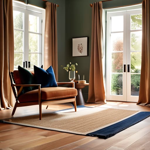
Once you grasp the basics, you can start playing with complementary color combinations to add that much-needed pop. In a kitchen, it might be the vibrant green of fresh basil against a deep red tomato sauce; in a living room, it’s that bold navy accent pillow against a warm ochre chair. It’s all about intentionality. You aren’t just picking colors because they look pretty; you’re building a sensory experience that feels as well-composed as a five-course tasting menu.
Using Interior Design Color Wheels to Balance Your Ingredients
Now, if you’ve ever tried to balance a complex reduction sauce, you know that one ingredient too many can throw the whole dish off. Designing a room is exactly the same. This is where interior design color wheels become your absolute best friend—think of them as your master recipe card. Just as I wouldn’t dump a whole jar of cayenne into a delicate consommé, you shouldn’t just grab colors because they “look pretty” on a swatch. You need a structural plan to ensure your space feels intentional rather than chaotic.
When you start playing with different hues, try leaning into complementary color combinations to create that high-impact “pop” you see in gourmet plating. Using opposites on the wheel—like a deep navy paired with a warm ochre—creates a visual tension that is incredibly exciting. However, if you’re aiming for something more soothing, like a quiet Sunday brunch in Vermont, focus on analogous colors that sit side-by-side. The goal is creating a cohesive room palette that feels as harmonious and well-seasoned as a perfectly executed five-course meal.
Seasoning Your Space: 5 Pro-Tips for Picking the Perfect Palette

- Start with your “hero ingredient.” Just like you wouldn’t let a heavy truffle sauce overpower a delicate scallop, don’t let one color dominate without a plan. Pick one standout shade that represents the soul of the room and build everything else around it to ensure balance.
- Test your flavors with small batches. Before you commit to painting an entire dining room a deep, moody navy, grab some samples and see how they react to the light at noon versus sunset. A color that looks like a bright summer citrus in the morning might turn into a heavy, murky broth by dinner time.
- Don’t fear the neutrals, but use them as your base. Think of neutrals—whites, creams, and soft greys—as your salt and pepper. They provide the essential foundation that allows your vibrant “flavor” colors to truly pop without making the whole experience feel overwhelming or chaotic.
- Create texture through tone. A monochromatic scheme isn’t just one flat color; it’s about layers. Imagine a dish featuring different textures of carrot—roasted, pureed, and shaved. Use varying shades and tints of the same hue to add depth and visual interest so your room feels rich, not one-dimensional.
- Follow your gut, but check the recipe. While design rules are great, your intuition is your best tool. If a color combination feels “off” to you, it probably is. If you love a bold, unconventional pairing, lean into it—just make sure you have a way to anchor those wilder notes with something grounding.
The Chef’s Final Garnish: My Top Three Takeaways
Treat your color palette like a signature dish; don’t overstuff it with too many “flavors” or you’ll lose the cohesive essence that makes the design sing.
Use the color wheel as your mise en place, prepping your hues in advance to ensure every element works in harmony rather than clashing on the plate.
Trust your culinary intuition—just like adjusting a sauce with a pinch of salt, sometimes the best color choices come from that gut feeling that something just needs a little more zest.
The Secret Sauce of Visual Flavor
“Think of your color scheme just like a signature sauce; you wouldn’t just dump a gallon of salt into a reduction and call it a day. You need to layer your hues with intention, balancing the bold, spicy accents against a smooth, creamy base to create a visual experience that leaves people hungry for more.”
Amelia Johnson
Serving Up Your Final Vision

At the end of the day, choosing a color scheme is a lot like perfecting a signature sauce; you have to understand your base ingredients before you can start adding those bold, experimental flourishes. We’ve walked through the fundamentals of color theory and used the color wheel to ensure our visual “flavors” don’t clash on the plate. Remember, whether you are picking hues for a brand identity or redesigning your home kitchen, the goal is to find that perfect equilibrium between contrast and harmony. Don’t be afraid to experiment with different combinations, but always keep your eye on the foundational balance we discussed to ensure your final result feels intentional rather than accidental.
As you step away from the screen and start playing with actual swatches or digital palettes, I want you to remember that there are no rigid rules in the kitchen of creativity. Just like my grandmother used to say back in Vermont, sometimes the best results come from a little bit of intuition and a lot of heart. Let your passion guide your choices, and don’t be afraid to add a little “spice” to your palette if it makes you feel alive. You have the tools, the knowledge, and the vision to create something truly spectacular. Now, go out there and cook up something beautiful!
Frequently Asked Questions
How do I pick a color scheme that doesn't feel overwhelming or "too much" in a small space?
Think of a small space like a delicate reduction; if you throw too many heavy ingredients in at once, you lose the nuance. To keep things from feeling claustrophobic, I recommend the 60-30-10 rule. Use a neutral “base” for 60% of the room, a secondary color for 30%, and save those bold, spicy accents for the final 10%. It keeps the visual palate clean while still giving your space plenty of flavor!
Can I use colors from my favorite ingredients or seasonal produce to inspire my room's palette?
Oh, absolutely! In fact, that is my favorite way to approach it. Think of your room like a seasonal tasting menu; using the vibrant purples of heirloom carrots or the sun-drenched yellows of summer corn creates an instant, organic connection to nature. It’s like plating a dish—you’re using natural hues to evoke a specific mood. Just remember to balance those “bold flavors” with some neutral “base ingredients” so your space doesn’t feel overwhelming!
What should I do if I find a color I absolutely love, but it clashes with everything else I already own?
Oh, I’ve been there! It’s like finding a gorgeous, exotic spice that’s too intense for your everyday pantry. Don’t panic—don’t toss it! Instead, treat that color like a “hero ingredient.” Use it in small, intentional doses—think a vibrant throw pillow or a single piece of art. By pairing it with neutral “base ingredients” like cream or charcoal, you create a sophisticated balance that lets that stunning color pop without overwhelming the whole room.


Amelia Johnson
I believe that food is not just sustenance but an expression of culture and creativity. Let’s explore how we can turn our culinary passions into rewarding careers that feed both our souls and our wallets.